Market dislocations occur when financial markets, operating under stressful conditions, experience large widespread asset mispricing.
Welcome to this week’s edition of “World Out Of Whack” where every Wednesday we take time out of our day to laugh, poke fun at and present to you absurdity in global financial markets in all its glorious insanity.
While we enjoy a good laugh, the truth is that the first step to protecting ourselves from losses is to protect ourselves from ignorance. Think of the “World Out Of Whack” as your double thick armour plated side impact protection system in a financial world littered with drunk drivers.
Selfishly we also know that the biggest (and often the fastest) returns come from asymmetric market moves. But, in order to identify these moves we must first identify where they live.
Occasionally we find opportunities where we can buy (or sell) assets for mere cents on the dollar – because, after all, we are capitalists.
In this week’s edition of the WOW: Beware The Attention Seekers!
I’m getting sick and tired of stupidity. No, really. There really are some proper morons out there. Just the other day I read in the Telegraph that living near a busy road raises your chance of getting dementia by 12%.
Being the sceptic grump that I am and taking very little at face value I was curious about this. After all, 12% seemed significant.
15 seconds later (I’m a bit slow) and my stubby fingers had met with my phone to reveal the medical journals stats on dementia. Lo and behold, there’s an 11% chance of getting dementia no matter where the hell you live. Further investigation revealed that the study in question actually showed that the risk of dementia caused by living near a busy road raised the odds TO 12%, not BY 12%. That little fact wouldn’t grab as many readers attention, though, now would it.
Key here is the abject failure to distinguish between relative and absolute risk.
Absolute risk is 11% and relative risk, if your pad overlooks a noisy highway with Mac trucks belching fumes out 24/7, increases this by a “whopping” 1%.
Think of it like this: Out of 100 people who are lulled to sleep at night by the comforting drone of 18 wheelers this “startling new research” reveals that 12 folks will be affected by dementia rather than 11. Now, I understand that there are those among us who desperately want that last 1% of longevity (you can find them scoffing the tofu at the buffet) but personally, I’m not so sure those extra days spent confusing my nurse, who’s changing my soiled diaper with my wife while being fed sludge through a straw are worth worrying about.
This sort of nonsense happens all the time.
It grabs our attention because our amygdala (that squishy almond shaped part of our brain that deals with fear) goes berserk trying to protect us from pain sending out “watch out, buddy” messages and getting us all lathered up with anxiety. There was a fascinating experiment done on this which I wrote about some time ago.
In any event, the headlines for this “startling” piece of trivia on dementia sound frightfully scary but are actually complete bollocks. The problem, of course, is that, unless you’re actually knowledgable in a particular area – in this instance medical research (which I’m not) – you’re likely to accept at face value what you see.
The same thing happens to folks evaluating financial markets. All too often there’s a vested interest or bias to selling a particular narrative. When your bread gets buttered running, say, a fixed income fund, it shouldn’t come as a surprise when you’re found searching for metrics supportive of more suckers investors plonking their hard earned dollars into your fixed income fund.
Other times, it’s a matter of simply looking at the trees failing to see that “whoah, we’re actually in a forest” and not using second order thinking.
Recently, I came across headlines screaming that the US stock market was due to crash. Whoah! The primitive part of my brain can’t help itself and kicks into action telling me to quickly find out more. How might I be at risk of being eaten by the lion it wants to know.
Reading through the article I noted that lo and behold, the author had some “little known” indicator that said it was so. Urghh! Listen there are NO, none, zero “secret” indicators OK? Nada! There are just indicators, and if you don’t know one that doesn’t make it “secret”. It just means you don’t know it.
For shits and giggles I read the report and, to summarise, the “indicator” was this:
Household equity ownership was now at the same levels we’d experienced in the 1960s and in 2007. Notably, two previous market peaks. Investors holding equities in both of those periods got their shirts handed to them. Ergo, investors are again going to get their shirts handed to them. Run!
Not so fast hombre…
Let’s deal with the data first.
Sure, equity ownership in both 2007 and the 60s was around the 30% mark, which is where we’re at today. And sure, both periods experienced painful stock market crashes, but looking deeper, we find that equity ownership has reached these levels before, most notably in both 1998 and 2013.
Take a look at the S&P500 from 1990 through 2009 below:
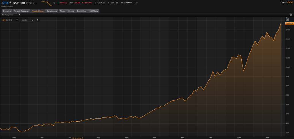
As you can see the market ran another 60% from 2008 when equity ownership had reached these levels. Anyone short got hosed. Anyone long made 60%.
Then in 2013 anyone short took a beating as the market ran another 40%.
I’ll also point out that the 87 crash took place when equity participation was at just 18% and, in fact, we’ve had stock market crashes when equity participation was well below current levels.
So now we’ve got two instances where the market tanked at these equity participation levels. We’ve also got two instances where it did the opposite.
Heck, I could come out screaming that, “Hey! Look, equity participation levels indicate that we’re about to rocket higher, somewhere between 40% and 60% from these levels. Look here is the data (selective, of course). Get in now, by George.”
Sheesh! I may as well flip a coin or go to Vegas and put it all on black because my odds are identical. Neither ideas impress me as a good ones. Both evaluations are just noise.
So using this as a “secret indicator” is a bunch of hogwash designed to get your amygdala all hot and flustered.
The problem is Joe Sixpack reads this, the mushy bit in his cranium does what it’s supposed to do (go haywire), and next thing you know, Joe’s shorting the market through some leveraged reverse ETF where not only is the risk that he’s wrong at least 50/50 but the cost to entry in this particular trade means that even if he’s right he doesn’t stand to make much money. And if he’s wrong he stands to lose a whole lot because those leveraged ETFs are terrible, terrible tools and Joe hasn’t done his homework to figure out how they work.
That is all as impressive as Miley Cyrus swinging naked on a wrecking ball – not so much.
Back to Basics
The way to think about this is taking it back to basics.
Let’s say you’ve got $1m portfolio. If you invest $300k into equities, then you’re at an equity participation level of 30%.
Fine, but what if you only invested $100k a decade ago and that $100k now (due to appreciation) sits at a 30% equity participation rate? Well, you’ve actually got another $900k in “spare cash” sitting on the sidelines. The 30% equity participation is a red herring.
Bull markets rarely end like that.
No, they end with Darren and Julie mortgaging the house, selling Bobby the family Labrador, and asking the oldies for a loan to invest. Once they’re fully invested with nothing left in the cookie jar you’ve got market exhaustion because there are literally no more suckers to come in.
Incidentally, at the tops of markets what we find is that mutual fund flows continue even as the market has turned. If we go back to look at the data, what we notice is that net inflows for dumb mutual funds money typically continue even after the market has turned. Darren and Julie via mutual funds keep buying into the peak…just as the 20% (Pareto’s law) begins to exit. The trade at this point is truly asymmetric as the boat is extremely one-sided. This is typically how bull markets end.
The other thing that isn’t even considered is where existing capital is invested.
Let’s go back to our theoretical $1m portfolio and say, for example, we’ve invested 50% into fixed income. So now we’ve got $500k invested. Let’s further say that we’re spooked by the fact we’re eking out a piddly 1% yield and concerned that lending our money to bankrupt entities might not work out too well in the long run. A simple rotation of just 10% from our fixed income basket into equities translates into a 17% capital infusion into our equity bucket. Looking at just one investment bucket is akin to looking at just one tree in the forest.
Clearly we need to look at more than just equity participation on it’s own before jumping to a conclusion.
Now, don’t get me wrong – I’m not supporting buying US equities here. Valuations are far from low, and history provides sufficient evidence that buying high in order to sell higher can lead investors from going from BMW to Suzuki pretty swiftly.
What I am suggesting is that you want to sit on the sidelines until you see favourable risk reward setups. The most favourable of all are where convexity exists and I don’t see any in US equity markets either long or short here.
What Do You Think?
-Chris
PS: For the next 39 days you can join the Capitalist exploits Insider membership for the inaugural price offering before the pricing is increased. Go here for more info.
“The way to build long-term returns is through preservation of capital and home runs” — Stanley Druckenmiller