 WHAT IF…
It’s been a while since we touched on the bond market here, but our buddy Kuppy just penned a thought-provoking piece on the topic. A short teaser:
Imagine what would happen if 30-year treasuries collapsed and yielded 10%, offering a real yield of almost 2%, or potentially enough to compensate you for 30 years of inflation risk. What would that do to other duration assets? What would that do to bank balance sheets, with their collateral values horribly impaired?? What would happen to insurers and all other financial institutions who are suddenly and effectively insolvent?? Could we all be living through a warm-up, and the real crash is when the Fed hits the pause button, detonating the bond market??
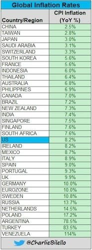
In a world where inflation in many developed countries now exceeds inflation in emerging markets (as the below graphic from @charliebilello indicates), Kuppy’s questions no longer strike us as purely theoretical.
 BONDS: GETTING SPANKED!
Speaking of bonds…
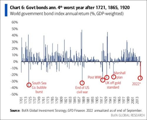
Most folks are fixated on the declines in the stock market. But bond markets are getting spanked this year and are on track for the fourth worst year in well over 300 years (h/t to @RonStoeferle for the below chart).
This prompted us to dust off our commentary on the bond market from an old Insider Newsletter issue back in 2016 (seems like a lifetime ago today):
It’s ironic that just when everyone on the planet was talking about “lower for longer” and the common thought on the street was that bonds were “safe havens”, the US bond yields were in the process of hammering out an ultra long-term (generational) boom.
Just as folks were surprised at how low bond yields went, they will be equally surprised at how high bond yields go (and the speed at which they will rise) over the coming months and years. Mean reversion is a powerful force, and remember that markets tend to overshoot.
We’re seeing it play out right now. The US 10-year treasury rate bottomed at 0.52% in 2020 and just hit 4% — and we think it has way higher to go.
It’s no surprise that anyone with their money in a 60/40 portfolio is getting torched this year.
The Wall Street Journal reports:
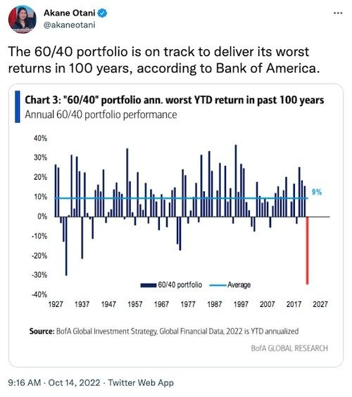
Investors with the 60/40 portfolio—who put 60% of their money into the stock market, and 40% of their money into bonds—are down 34% for the year, according to Bank of America. That marks the worst performance for the classic portfolio in the past 100 years.
The appeal of the 60/40 portfolio is that when stocks have a bad year, bonds usually deliver some relief. What’s made this year’s selloff so painful for so many investors is the fact that very few trades have worked.
We said it before and it bears repeating: 60/40 portfolios (and by extension, risk parity portfolios), which every darn “investment advisor” stuck and probably still sticks their clients’ money into are the equivalent of wading scrotum deep into a shark-infested pool — a terribly bad idea.
 ALL THINGS TRANSITORY…
Feels like a lifetime ago, when — back in February 2020 — we started warning that lockdowns will bring about inflation and shortages. Fast forward to today, and this pesky stuff is now part of our daily lives. We recently set up a dedicated inflation channel in our Insider private forum, where members can share their own experiences with all things “transitory”.
Member Russ shared an insightful picture that highlights how significant inflation is for so many business (and everyday people):
My cousin’s bakery posted this to help customers understand why their pies now cost more.
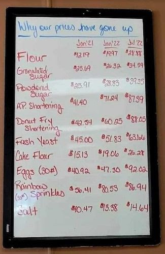
Goodness, just look at the prices of flour and eggs. They more than doubled in ~18 months.
But hey, we’re told inflation is “just” 8.2%, so it could be worse…
 COMMODITIES: CHEAP AS CHIPS
You’ve probably seen this chart (or a variation of it) before (we lifted it from Marathon Resource Advisors’ latest report)…
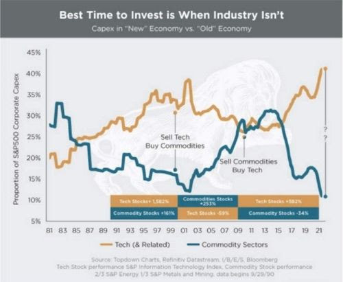
It suggests commodities stocks are “cheap as chips,” while growth stocks have much further to fall. And for extra impact (and to impress people at cocktail parties — though you might not be invited back), consider this…
Right now, after all the bloodbath we’ve seen in tech stocks so far, Apple still has a larger market cap than ALL the energy stocks in the S&P 1,500 combined (h/t to @WillieDelwiche for the chart).
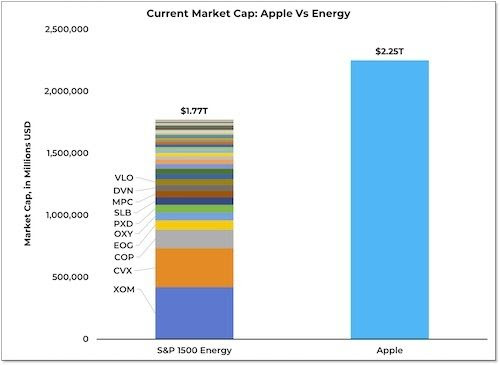
Let that sink in…
 WEEK’S HUMOUR
A brief primer on ESG zealotry (h/t @duediligenceguy)…

So, which oil painting are you going to glue yourself to this week?
Have a great one!

