Like a bad case of hemorrhoids, debt is a topic too often left out of polite conversation. It’s a good thing then that you don’t come here for polite conversation! It is a topic previously written about in these pages and one which has the power to keep me awake at nights when I really ought to be doing other things.
In our quest to clearly understand debt around this ball of dirt we call home, how it impacts us, if it impacts us and what it all means, we’ve had our team put together a comprehensive report on the topic.
The report itself is completed and currently with a gentleman who takes our analytical work, adds some witchcraft and makes it look readable after I’ve finished with it. As soon as we receive this ergonomically designed masterpiece, readers will find it magically appear in their inbox. If you’re not a subscriber then, for goodness sakes, sign up NOW already.
Littering my desktop like paper bags on a Nairobi highway are dozens of graphs – the remnants of this debt report. I thought therefore I’d take some of the scraps and provide readers with a short sampling of what is really a visual ice bath.
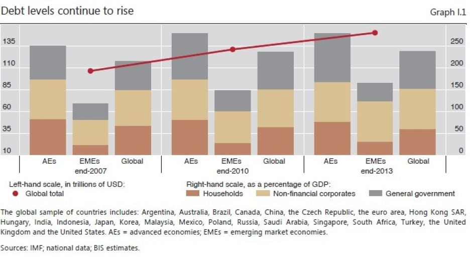
Earlier this year the Bank of International Settlements said in its annual report that debt ratios in the developed economies have grown by 20 percentage points to 275 percent of GDP since the beginning of the global financial crisis. Albeit not as severe, the trend is similar in the emerging economies where debt ratios have grown with the same pace to 175 percent of GDP, thanks to the spillover effect of central bankers in the developed world testing their limits with low interest rate policies.
The Bank warned that global debt levels could trigger another Lehman-style crisis, calling continued debt accumulation over successive business and financial cycles as the root (rather than the solution) of the problem.
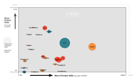
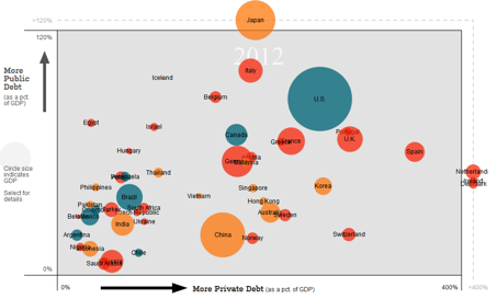
The symptom, however, goes way further back than just 2007. As you can see in the charts below (taken from the Wall Street Journal), both public and private debt levels have been expanding since the early 90s.
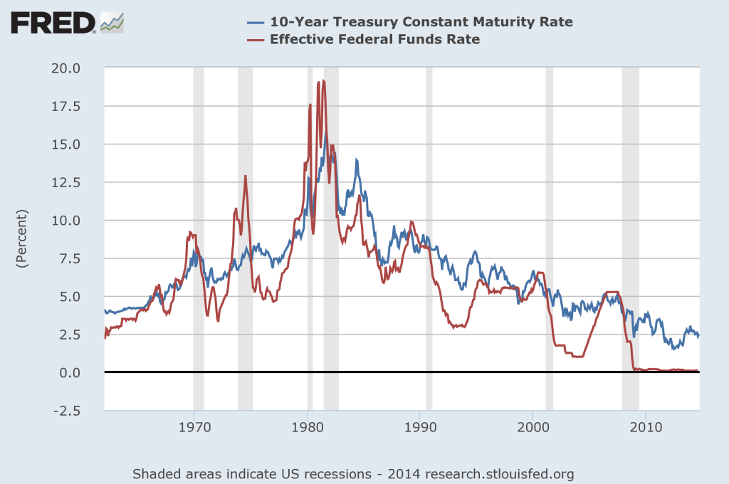
With interest rates trending downwards for the past 30 years and eventually hitting rock bottom in late 2008, it is no wonder that the global debt levels have swollen to 200 year highs. Yep, 200 year highs!
Although the chart above only shows the US rates, the situation is similar all across the globe.
It looks like the central bankers of the world have painted themselves into a corner. Growing mountains of debt makes it harder for economies to grow at higher interest rates, hence forcing central banks into a downward spiral of record low rates and monetary stimulus that simply encourages more borrowing, and a worsening of the underlying problem – what the BIS calls “a debt trap” – where low rates essentially validate themselves.
Just a few weeks ago Spain, one of the Europe’s ailing economies, issued a 50-year bond at a mere 4 percent rate. This is Spain for God’s sake. They’re broke!
There are some truly crushing debt burdens lurking in full view right here and now. Debts which cannot be repaid and will not be repaid!
Personally I tend to keep on top of this sort of information, but I’ll be honest with you, when I say that what our analysts have put together scared even me, and here I was under the illusion that I was adequately informed! We believe it is vital for every investor to keep an eye on this information.
– Chris
“Blessed are the young for they shall inherit the national debt.” – Herbert Hoover


